
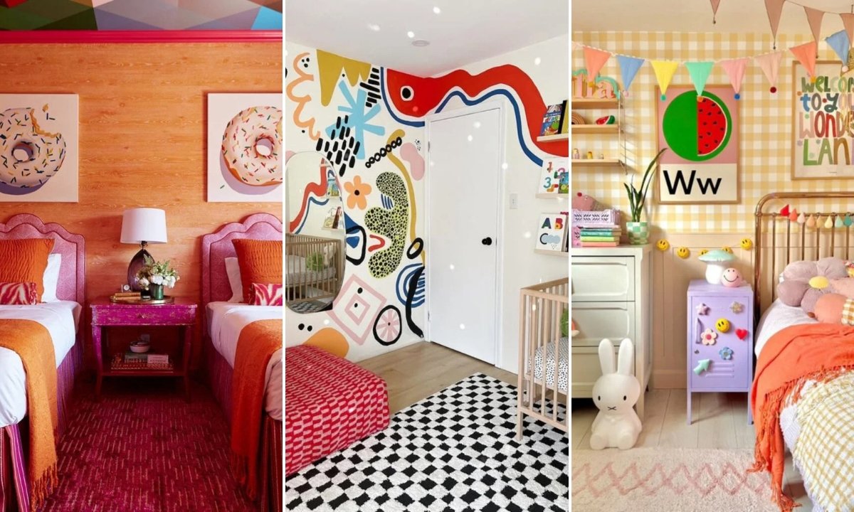
24 Colorful Kids Room Ideas for 2026
You’re not the only one who has looked in your child’s room and thought, It looks so plain, but what if I mess it up.
You want some color. You want character. You want the kids to be joyful and creative. You don’t want the room to be too noisy, untidy, or hard to fix later, though.
And painting everything again. That sounds like a lot of work. The good news is that you don’t have to completely change the look of a neutral kids’ room to make it feel lively.
This article covers 24 Colorful kids bedroom ideas that feel fun, not childish. Perfect for kids who are outgrowing toddler rooms.
Let’s jump in!
What’s The Easiest Way To Make a Neutral Kids’ Room More Colorful?
Begin with something little. Don’t paint the whole room again. Don’t get new furnishings. Just put color in one clear area.
Choose one place, generally a wall, and make it the main emphasis. The whole area changes right away if you paint one wall a gentle blue, warm green.
If you don’t want to paint, change the bedding, add a bright rug, or hang some vibrant wall art. One big change makes a difference. Five small random ones make a mess.
Choose one bold piece and build around it if you want color without tension. Make sure the base is neutral. Let the hue speak for itself.
Save this article for later!👇👇👇
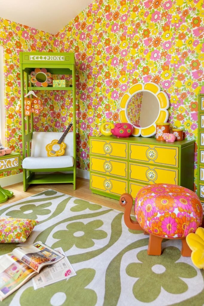
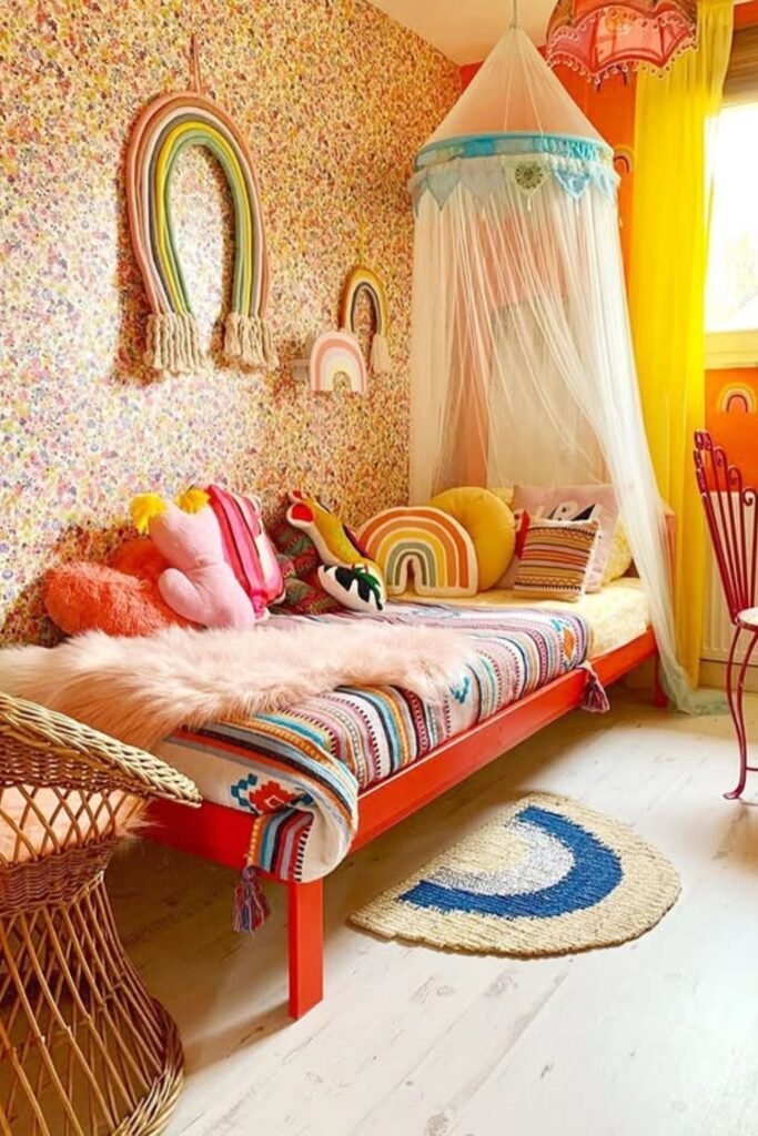
Flower Power
Bold doesn’t have to mean chaotic. A full floral wallpaper like this works because everything else follows the same story.
There are pink, yellow, and green patterns on the walls, furniture, and decorations that make everything feel planned.
Where is the best spot for this kind of energy. A kid’s bedroom or playroom that is more about creativity than minimalism.
Begin with one strong patterned wallpaper to duplicate it.
Then pick out two or three colors from that pattern and paint them on furniture, such a dresser, a mirror frame.
Look at how the rug has big flowers in softer colors. That balance maintains the room fun without making it too much.
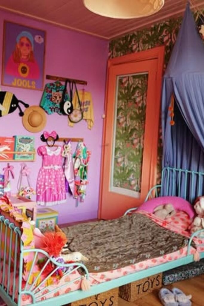
Color Blocking
One wall doesn’t have to match the next. That’s the charm here.
Lavender meets leafy green wallpaper, coral trims the door, and a soft blue canopy hangs over the bed.
When each wall has a purpose, contrast works. Use patterned wallpaper to make one side stand out.
Let another wall have solid paint on it. Then connect them with little repeats, such bedding, paintings, or storage bins that have the same colors.
Great for kids who like to see the little things and get to know others. This method works well for bedrooms with strange layouts because each part feels planned.
Choose three major colors and stick with them if you wish to do this. Don’t keep adding additional colors. Repetition makes things flow. Without it, color becomes noise.
Rainbow Layers
Color feels softer and it comes in layers instead of blocks.
Notice how the wallpaper carries tiny florals while the bedding, pillows and wall decor repeat rainbow tones.
Nothing stands out but everything feels alive. Great for kids who adore color but still need a cozy place to sleep.
This kind of warmth works well in bedrooms that get a lot of natural light. To make it again, blend patterns that are all in the same color family.
Put in bedding with stripes. Add rainbow pillows, but make sure the colors stay the same: warm oranges, yellows, and gentle pinks.
There should be soft materials near busy walls. Plush blankets, braided rugs, and light drapes moderate the energy in the room so it feels fun instead of too much.
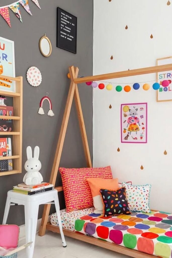
Playful Corners
Grey walls don’t have to feel boring. Add one bold bedding set filled with color, and the entire mood shifts instantly.
This method works best in small bedrooms. Keep the walls neutral, and let the fabrics and accessories show off your style.
Change the bedding, add cushions with patterns, and hang up colorful art. No painting needed.
To add color at eye level without making the floor look cluttered, wrap it with string lights or pom-pom garlands.
Change the cloth when your tastes change. Walls that are neutral will always be in style, but the pleasure comes from things you can readily change.
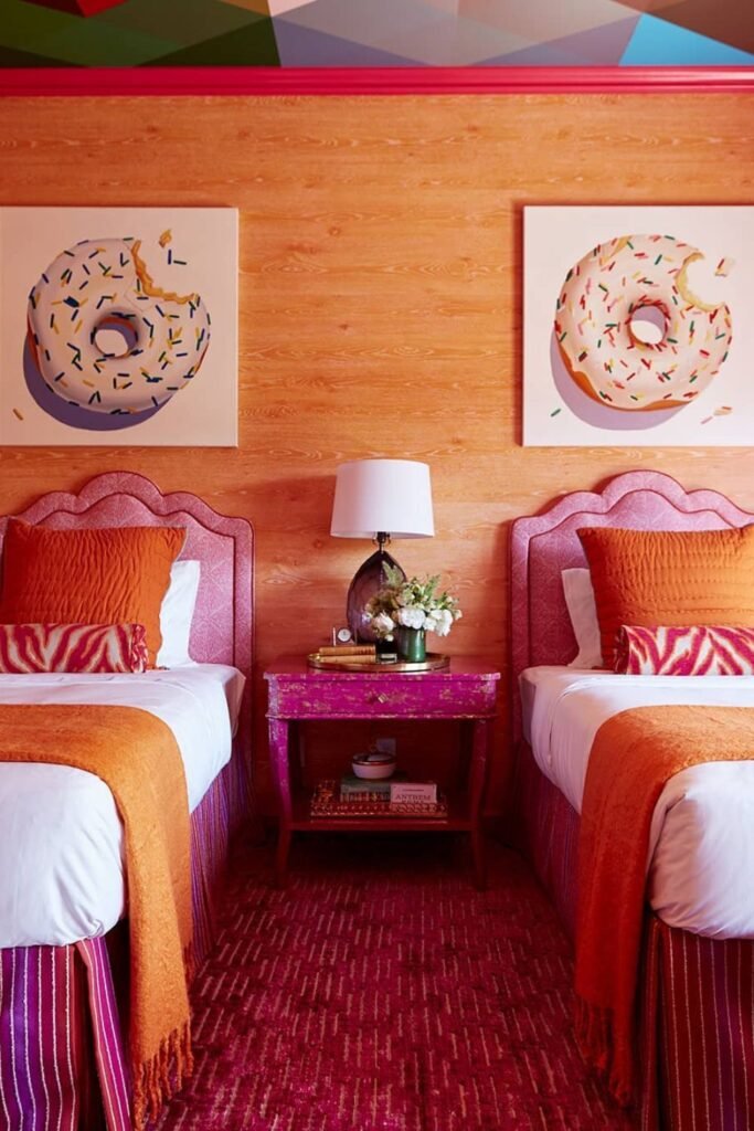
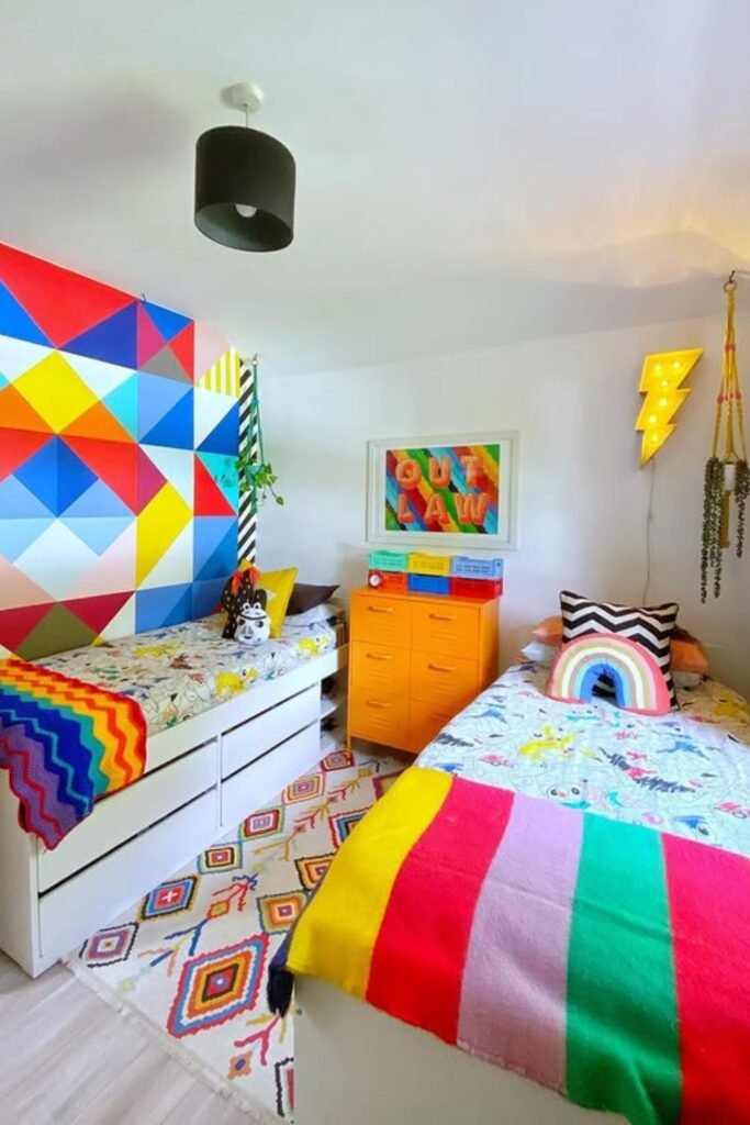
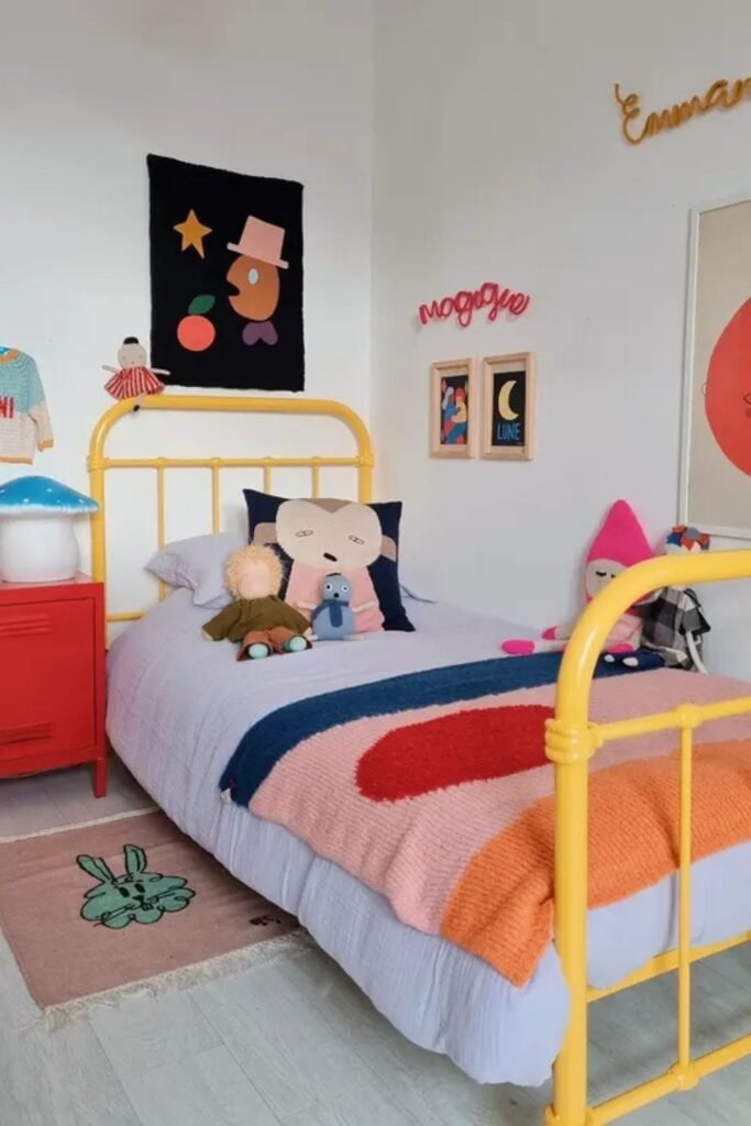
Twin Energy
Matching beds don’t have to feel plain. Bold headboards, rich orange throws, and punchy pink accents turn a simple twin layout into something full of personality.
Symmetry is good for bedrooms that are shared. Two matching beds make things look balanced, especially when the walls are already very colorful.
See how the warm wood background keeps everything in place. The pink and orange would be too much without the neutral base.
To get this effect, pick a main warm hue, like orange, and then add a supporting color, such hot pink. Do the same thing on bedding, a table, or even a rug.
A great choice for siblings who share a room but want it to still be entertaining. Keeping the framework the same keeps the peace. Color gives things personality.
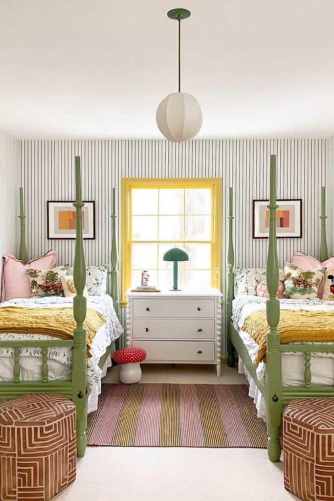
Soft Contrast
Calm doesn’t mean colorless. Sage green beds paired with mustard throws and blush pillows prove that soft shades can still feel cheerful.
The neutral tone of the striped wallpaper makes the background quiet, so the painted bed frames stand out without being too loud.
That’s the trick let one element carry the color, and let everything else support it. This method is great for shared rooms.
Matching beds make things neat, and tiny changes to cushions or decorations make each child feel special.
To make it again, choose a muted hue for the bigger pieces of furniture. Then use bedding and little decorations to create two softer accents.
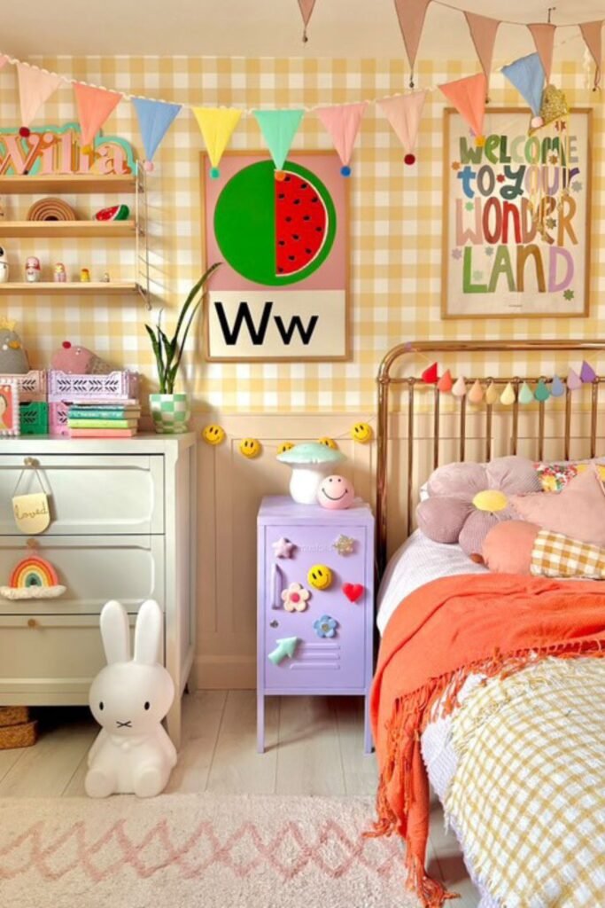
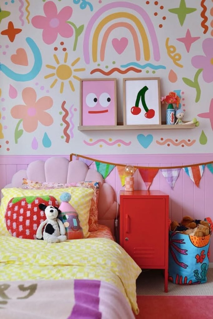
Happy Layers
Joy lives in the details here. Gingham walls set a soft backdrop, but the real energy comes from the layered pieces bunting across the ceiling, colorful wall art and playful storage.
When colors keep in line, small bedrooms feel bigger. You can see how coral, yellow, and soft pink are used again and again in the room.
That repetition keeps things together instead of spreading out. To make this again, pick patterned wall gingham works great for kids and add lightweight decorations around it.
Garlands made of fabric give color without taking up room. Change those boring drawer knobs for ones that are more interesting.
Hang bold, uncomplicated prints at eye level to make the room feel like yours. Good for younger kids who like bright, happy places.
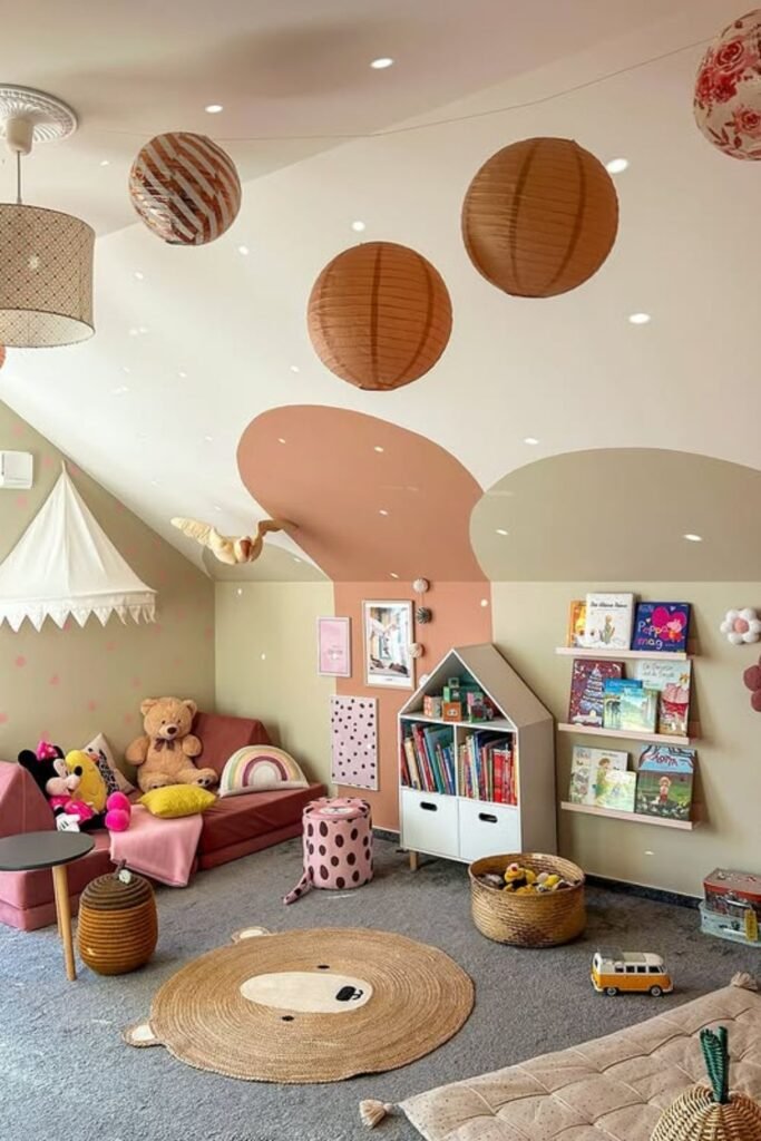
Ceiling Magic
Look up. Color doesn’t always belong on the walls. Soft blush and sage shapes stretch across the upper wall and ceiling line.
Making the room feel fun right away without crowding the bottom half. The floor space stays tranquil, which is great for playrooms where toys already make noise.
Ceilings that are sloped often feel strange. When you paint curving color blocks along that angle, the building suddenly seems like it was planned.
Put those colors together with hanging paper lanterns to provide color to the ceiling instead of the walls.
Start by drawing organic forms to recreate this. Use only two or three muted colors so that the end effect seems imaginative, not messy.
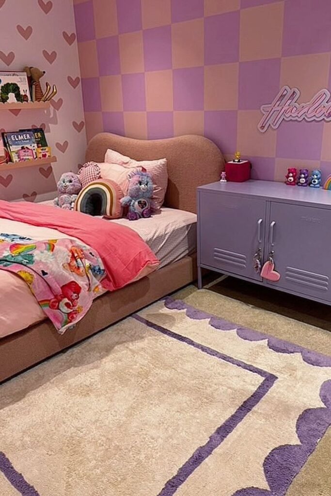
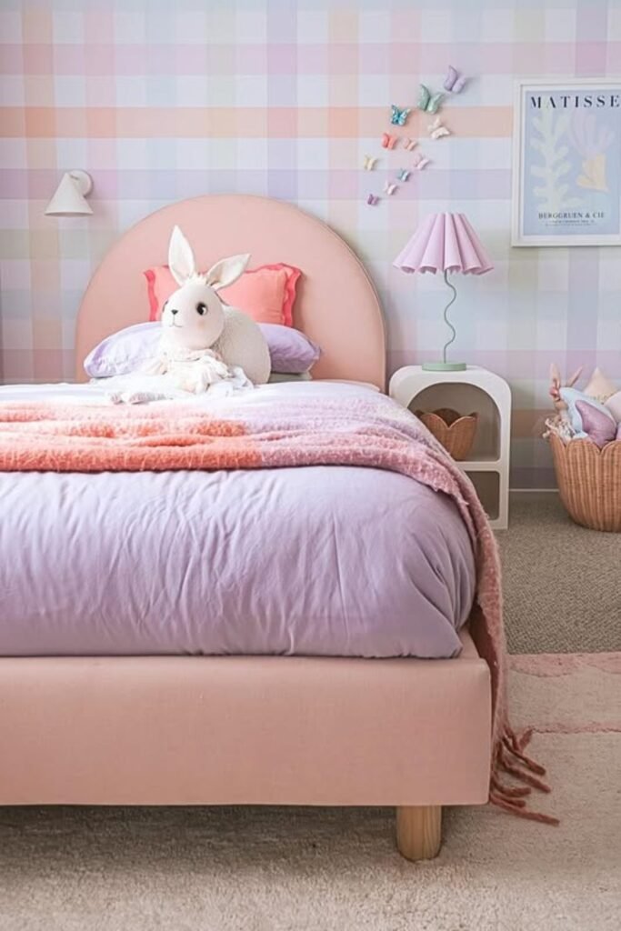
Sweet Checks
Checkerboard walls instantly bring personality without needing busy wallpaper. Soft lavender and blush squares keep the pattern playful instead of loud.
Especially when the remainder of the room is in the same color family. This kind of wall works best behind the bed.
It makes the headboard stand out and frames the region where you sleep. The wall across from it could be calmer.
Use painter’s tape and two colors that go well together to make it again. Matte finishes make the design feel softer instead of sharper.
To make the area feel more put together, bring one of those hues to a dresser or cabinet. Great for kids who like bright colors but still need a place to sleep at night.
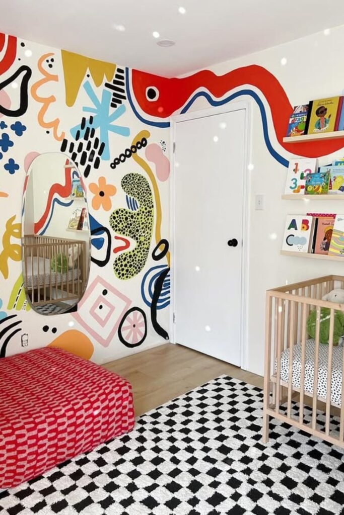
Art Wall
Plain white walls don’t stand a chance here. One oversized mural turns the entire room into a storybook without adding extra furniture or clutter.
In nurseries and toddler rooms, bold abstract forms are great because they change as the child grows. No cartoon theme to get tired of.
No stickers of characters that you can peel off later. Just color and motion.
To do this again, start by picking a small color palette, such red, mustard, blue, black, and light pink.
Lightly sketch freeform shapes with a pencil, then fill them in with flat paint. Don’t try to be flawless. Lines that aren’t quite perfect give things character.
The wall stays the star when you choose natural wood cribs and neutral carpeting. When one surface has that much vitality, everything else should help it settle down.
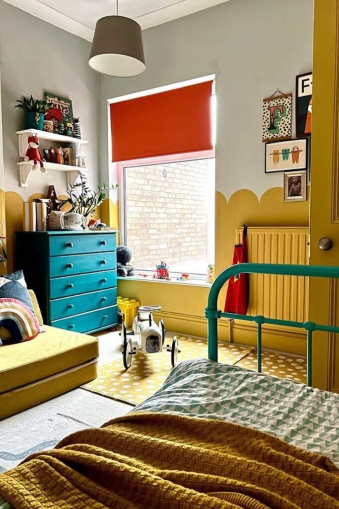
Bold Base
Half-painted walls change everything. Mustard along the lower section anchors the room, while soft grey above keeps it breathable.
That basic cut makes the color feel planned instead of too much. You don’t need wallpaper to give your walls charm; scalloped edges do that.
You can make this again in a weekend with painter’s tape and a steady hand. Pick a warm color for the bottom half, such mustard, olive, or subdued terracotta.
This method works great in bedrooms that get a lot of natural light. Strong color stays at eye level, not at the ceiling, so the room still feels open.
Make the wall color match the furniture. A teal bed frame and matching dresser contribute to the vibrant energy without changing the color scheme.
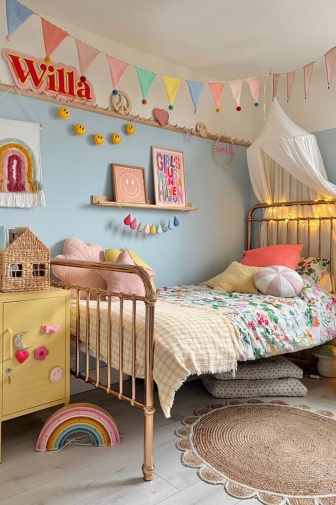
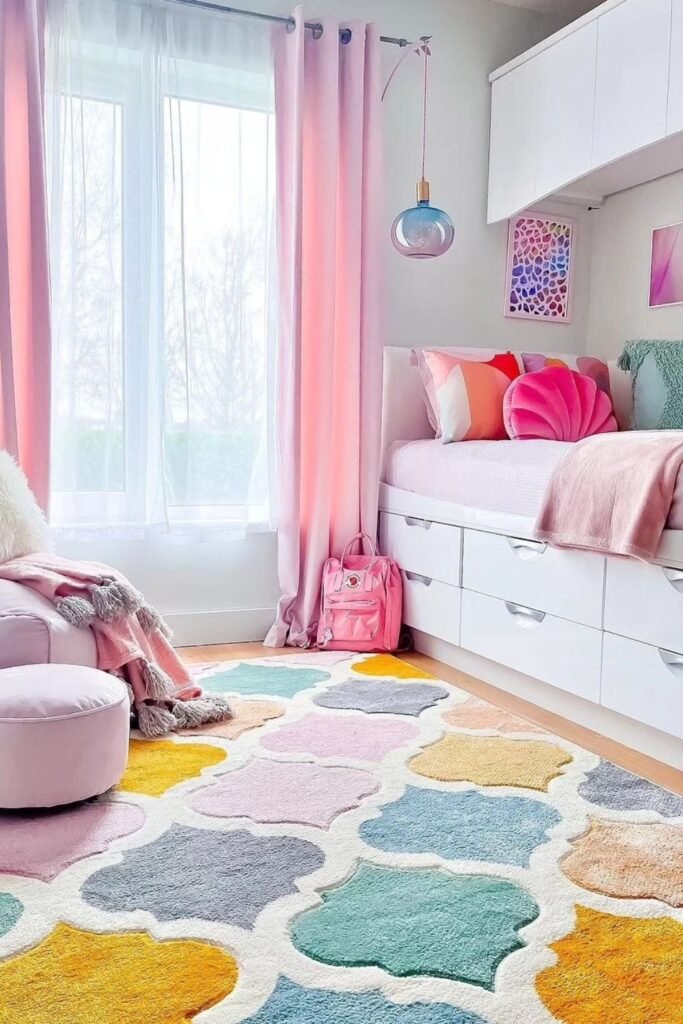
Pastel Charm
Soft blue behind the bed changes the whole mood without overpowering the room. One painted wall creates a backdrop that lets everything else garlands, art, bedding stand.
For smaller bedrooms, light colors like dusty blue, pastel pink, or mint look great. They give character and still let light through.
Not a weighty feeling. No dark spots. Use simply one peaceful pastel color on the wall behind the bed to make this again.
The other walls should stay neutral. Add soft pops of color with bunting, framed pictures, or fun storage.
Look at how the yellow locker and rainbow decorations have small brilliant colors that repeat. That’s the secret. Base in pastel. Small, powerful embellishments.
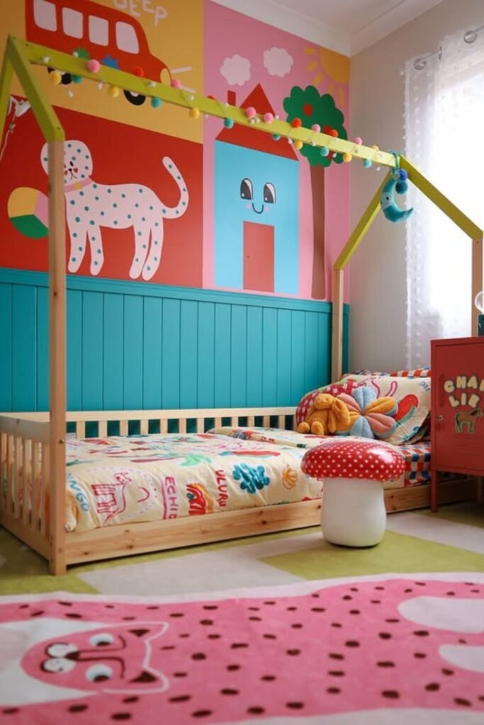
Story Walls
Walls can tell stories without a single framed picture. Large painted shapes a bus, a tree, a playful house turn the bedroom into a mini world kids can imagine inside.
Great for toddlers and youngsters in preschool and early elementary school who like bright colors.
Make the bottom half of the room less busy by using beadboard or solid paint. This will keep the area from feeling congested at eye level.
Plan the design in blocks to make this happen again. Draw huge shapes first, then color them in with a solid hue. Stay away from small details.
From across the room, bigger forms are easier to read. Put it next to plain wood furniture so that the mural stays the main emphasis.
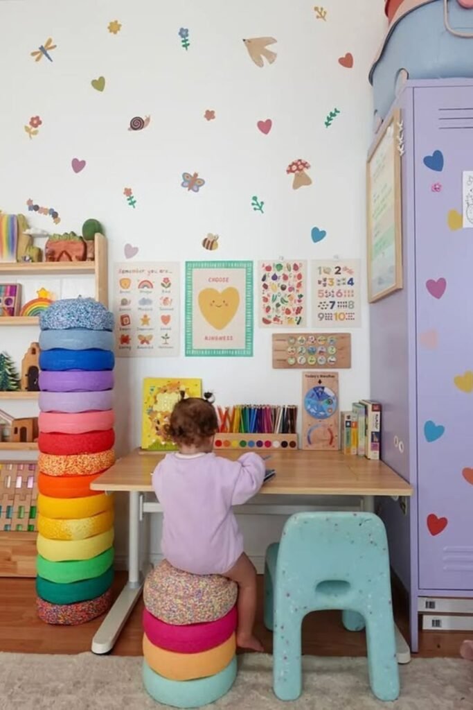
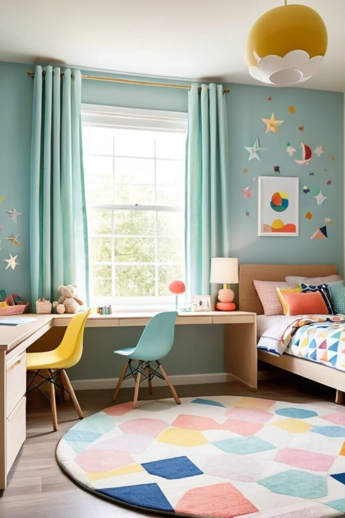
Learning Nook
Homework feels lighter in a space filled with gentle color. Tiny wall decals hearts, flowers, butterflies add personality without turning the study area into visual noise.
Best for a tiny playroom or bedroom corner where you need to pay attention.
Make the desk space neat and tidy, and then add color with things around it, like a stack of rainbow.
To make this happen, use little, distributed decals instead of one enormous mural. Put them loosely on the wall so the room feels open.
Add open shelves with books facing forward to add color in a useful way. Take a look at how the pastel locker matches the colors on the wall.
Using the same color on all of your furniture keeps everything together. There is no need for prominent walls in study areas.
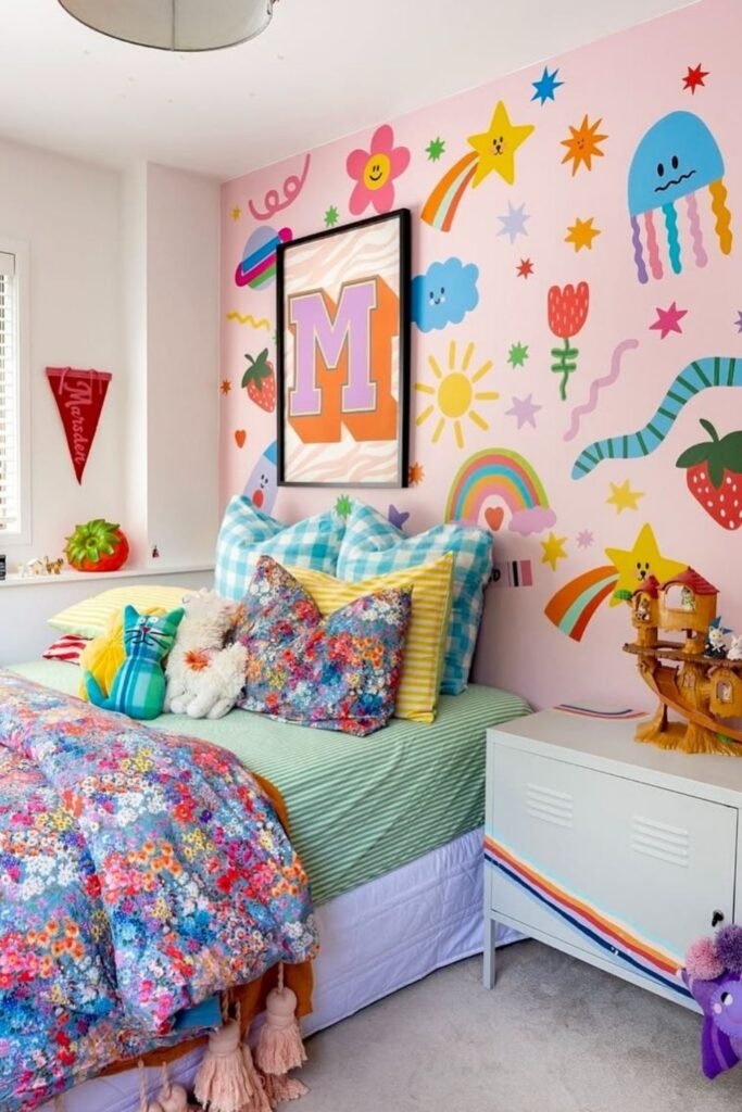
Whimsy Burst
Big personality fits perfectly on one wall. Oversized rainbows, flowers, squiggles, and stars turn a simple bedroom into a happy backdrop without needing layered decor.
A great choice for kids who like bright colors and being creative. Limit the mural to the top half, and paint the bottom half a solid color, such blush or soft pink.
That split in the picture keeps the room stable. To do this again, choose five or six fun shapes and use them in different sizes.
Use a color scheme that works together, like pastel pink, mustard, mint, coral, and sky blue. This will make the room feel more put together.
Keep furniture simple. Here, a locker or nightstand with a solid color works better than one with a pattern.
Sticker Splash
Commitment issues with paint. Large wall decals solve that fast. Bright stars, rainbows, fruit, and playful shapes instantly turn a soft pink wall into something full of personality.
This strategy works best for rooms that are easy to rent.
Peel-and-stick designs offer bright color and can be taken down later without hurting anything. Great if your tastes change every year.
Pick one foundation wall color first to make this again. Then, instead of covering every inch, put big decals on top of one portion.
Leave some space between the design elements so it doesn’t feel crowded. Use bedding and little furniture accents to connect the wall to the rest of the room.
Look at how the rainbow on the cabinet matches the art on the wall. Repetition helps decor that can be taken down look like it was meant to be there.
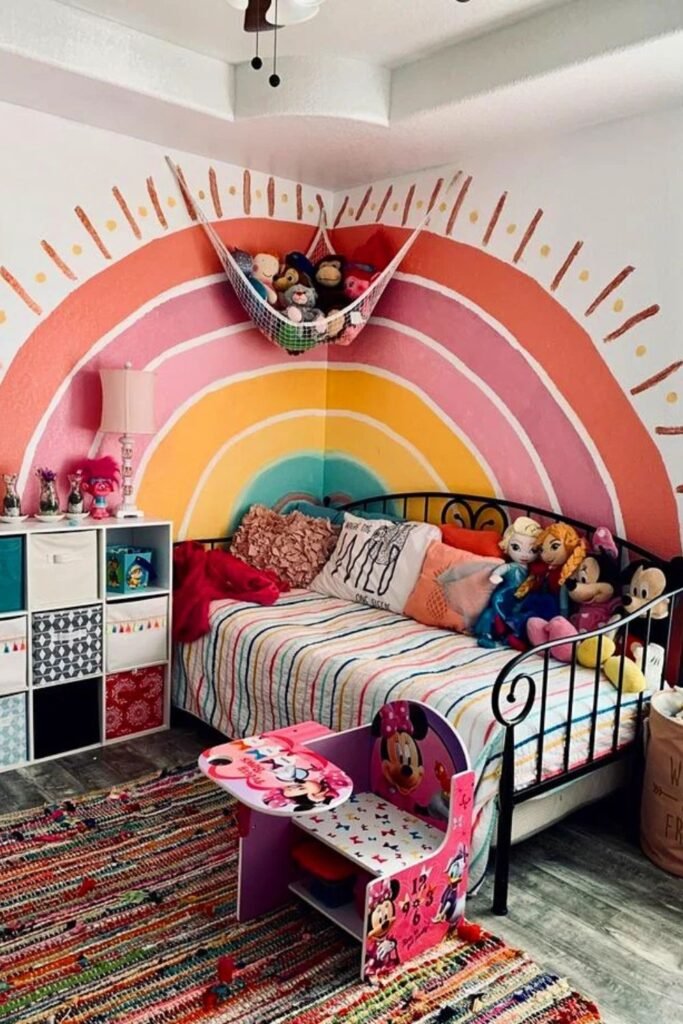
Rainbow Arc
One giant rainbow can anchor an entire bedroom.
Instead of scattering color everywhere, those curved bands behind the bed create a clear focal point that feels joyful organized.
People often forget about corners. Painting the rainbow on both walls makes that weird angle look like a feature.
Great for small bedrooms if you want to make a statement without adding a lot of extra decor.
Draw huge arches that spread out from the bed to make it look like it did. Start with the lightest color in middle and work your way up to warmer colors like coral and peach.
The rest of the room should be utilitarian, with simple storage cubes and bedding that is neutral with modest stripes.
Rug Focus
Walls can stay white and still feel colorful. One bold rug changes the entire mood without touching paint or furniture.
Patterned flooring is great for small bedrooms or shared spaces if you don’t want a lot of stuff on the walls.
The rug has several colors at once, but the soft pink curtains and pastel pillows keep tranquil. Choose a striking rug first to recreate this.
Take two or three colors from it and use them in bedding or cushions again. Don’t introduce new random tones. Let the rug be the main color.
The color doesn’t feel juvenile because the beds are low and have storage built in. Great for kids who are getting older but still want their room to have personality.
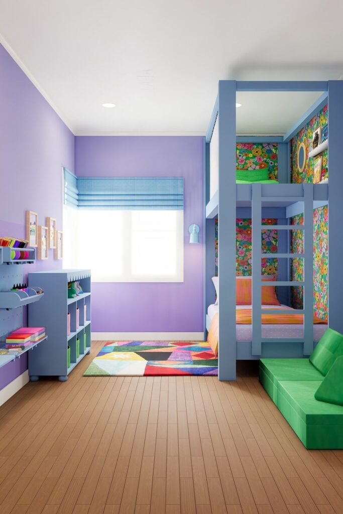
Loft Layers
Vertical space often goes unused. A loft bed instantly doubles function and opens up room for bold color underneath and around it.
The purple walls create the tone in this room, but the main effect comes from the patterns on the walls in the bunk area.
The floral wallpaper around the sleeping area makes it a comfortable hideaway without making the whole room feel too busy.
Great for small bedrooms with little floor area. Put the bed up higher and then put a study desk or storage under it.
Hexagon wall panels give the room some texture without taking up floor space. To make everything look like it belongs together, use the same colors in carpets or cushions.
Graphic Pop
One geometric wall can carry the whole room. Bold triangles in red, blue, yellow, and teal create instant energy without adding extra decor.
This method works best in shared bedrooms. Make one side strong and graphic, and let the other walls keep white so the room doesn’t feel too full.
Use painter’s tape to make huge triangle shapes on the floor. Pick four or five bold colors and use them again and again on bedding or a rug.
Here, clean lines are important. Sharp edges make things look trendy instead of cluttered.
Use simple furnishings to balance out bold walls. The room doesn’t feel messy because of the white bed frames and clean storage drawers.
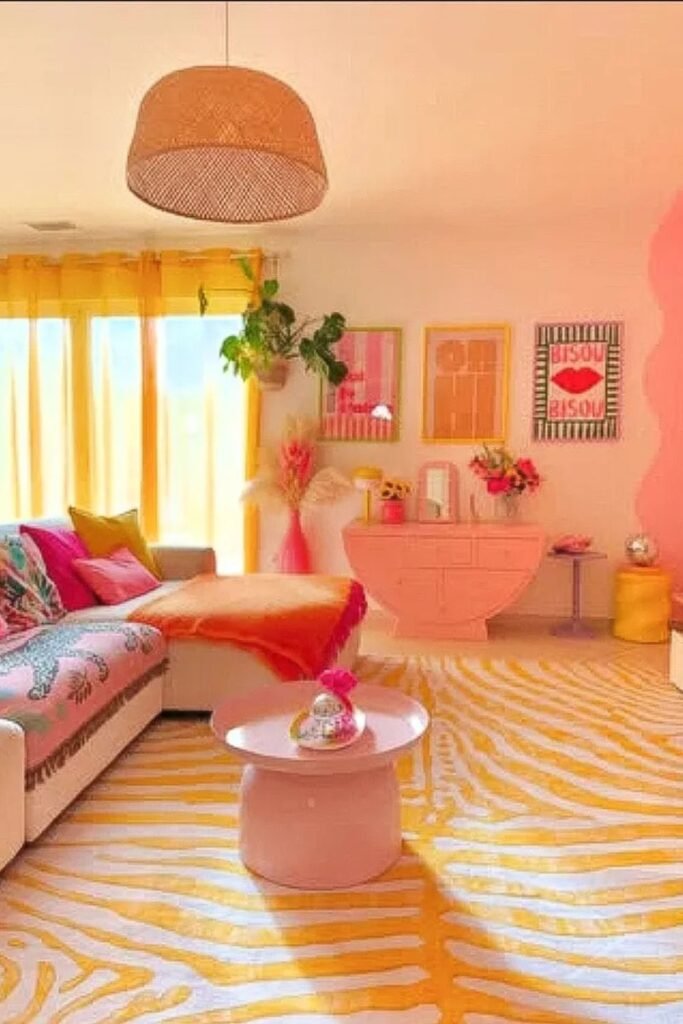
Warm Glow
Sunlight becomes part of the color palette here. Sheer yellow curtains filter the light, casting a soft golden tone across the room without repainting a single wall.
If your room has big windows, you may change the mood right away with fabric.
If you change your basic white curtains to warm-toned sheers, the whole room will feel brighter.
Coral furniture and pink accents add to that warmth without taking away from it. Notice how the rug has a subtle pattern of yellow instead of a stark block.
That keeps the floor interesting without becoming too noisy. Start with fabrics to make this happen again. First, curtains.
Then add one or two warm colors, like coral, peach or mustard to cushions or small pieces of furniture.
Star Sprinkle
Soft teal walls set the tone, but tiny metallic stars steal the spotlight. Scattered across one side, they add movement without overwhelming the room.
Great for bedrooms where you want to study and still be tranquil. A solid wall color keeps the attention fixed, and modest decorative touches give it character.
You can see that the desk is right up against the wall that is colored. The background makes the workspace feel planned.
To get this look, pick one calming color, like teal, sage, or light blue. Instead of a whole mural, use lightweight wall decals or little 3D objects after painting.
Make the spacing uneven so it seems fun. Use the colors from the bedding to add to the rug and chairs.
Primary Punch
Bright yellow bed frames instantly wake up a neutral room. One strong furniture piece can do more than repainting every wall.
The white walls are simple, which lets dramatic elements like a red nightstand, graphic wall art, and vibrant bedding stand out without clashing with each other.
Color feels intentional because it’s placed in clear, defined spots. Primary tones look great in bedrooms with a lot of natural light.
Pick one color for the bed or dresser that stands out, then use little hints of it in fabrics or art. Don’t add five more bright colors. Stay with two or three powerful players.
Simple shapes and graphic prints give the appearance a modern feel instead of a childlike one. Strong colors don’t need wallpaper that is too busy.
Soft Pastels
Gentle color can feel just as impactful as bold tones. Blush, lavender, and muted peach blend across the checkered wall without overwhelming the room.
Great for kids who like color but need a quiet place to sleep. Pastel colors look well in bedrooms with soft lighting.
There is no sharpness or loudness.To get this look, pick three or four light tones that are all in the same family.
To make a washed look, use painter’s tape to make a faint grid and then switch up the colors. Everything feels cozier with a matte finish.
Keep furnishings basic and round. Curved headboards and soft fabrics make things more peaceful. Don’t put in pieces with a lot of contrast. Keep the wall pattern soft.
FAQs
How do I add bold colors to my child’s room without making it feel overwhelming?
Start by restricting where the bright color goes. Pick one thing, like a wall, a rug, a bed frame, or even curtains, and let that be the primary point.
The rest of the space should be neutral or in softer colors. Use the vivid color in small amounts, like on pillows or in art, so it feels like it all goes together.
What if my child changes their favorite color every year?
Don’t make long-term promises. Use removable wallpaper and decals or keep the walls neutral.
If you want something bold but flexible, paint the furniture instead of the walls.
That way, you won’t have to start over when your tastes change; you’ll just update your accessories.

Hi, I’m Afaf! I’m a law student who loves writing about everyday life – from home projects and crafts to fashion, beauty, and parenting tips.
I’ve been writing for over a year, sharing ideas that are simple, practical, and easy to try. I write about things I find interesting and useful, whether that’s organizing a space, trying a new DIY, or finding activities to keep kids entertained.
My goal is to share helpful ideas without making things complicated. If it works in real life, I’ll write about it.
When I’m not studying or writing, I’m usually experimenting with new projects or scrolling for inspiration!